Favicon
A favicon is the small icon of a website that enhances brand recognition and identity in the browser tab or on the home screen.
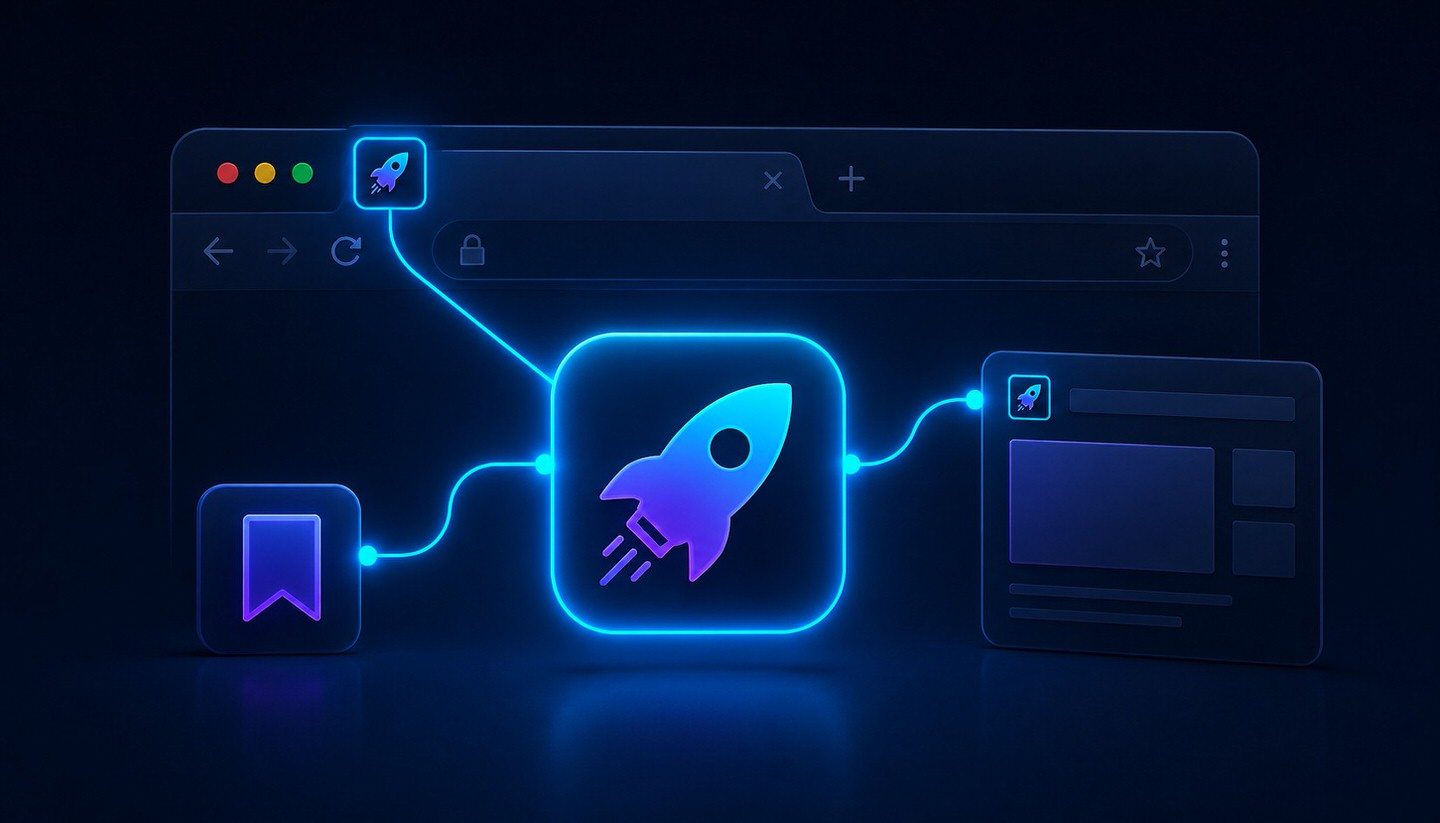
What is a Favicon?
A favicon (short for "favorites icon") is the small symbol that represents a website. It appears in the browser tab next to the page title, in the bookmarks list, and as an app-like icon when a page is saved to a smartphone's home screen. As small as it is, it serves an important function: it makes a website instantly recognizable.
Why is the Favicon Important?
- Recognition: When many tabs are open, the desired page can be found much faster by its favicon than by text alone.
- Brand Identity: The favicon is a small but consistent part of the brand presence and strengthens recognition.
- Professional Impression: A page without a favicon only shows a neutral default symbol in the tab. This can quickly appear unfinished and unprofessional.
- Visibility in Search Results: Google now also displays the favicon directly in mobile search results next to the page title. A clear, distinct favicon can help an entry stand out more.
How is a Favicon Integrated?
The favicon is integrated in the <head> section of the page via a <link> tag. A modern, common approach looks like this:
<link rel="icon" type="image/png" href="/favicon-32x32.png" sizes="32x32">
<link rel="icon" type="image/svg+xml" href="/favicon.svg">
<link rel="apple-touch-icon" href="/apple-touch-icon.png">
The apple-touch-icon is used when a user saves the page to the iPhone or iPad home screen. It should be larger (typically 180x180 pixels) to ensure it appears sharp there as well.
Which Formats and Sizes Make Sense?
- Formats: The classic
.icoformat works in all browsers. Modern websites also use.pngand.svg. An SVG favicon has the advantage of remaining sharp at any resolution. - Sizes: Instead of just 16x16 pixels, multiple sizes should be provided, such as 32x32 and 48x48 pixels. For display in Google search results, Google recommends a favicon with dimensions that are a multiple of 48 pixels (e.g., 48x48 or 96x96 pixels).
Tips for a Good Favicon
- Keep It Simple: With so few pixels, details get lost. A clear symbol or a single letter works better than a downsized, complex logo.
- Good Contrast: The favicon must be recognizable on both light and dark backgrounds, as browsers use different tab designs.
- Match the Brand: Ideally, the favicon incorporates colors or shapes from the brand logo to ensure recognition.
Practical Notes
For creating a complete favicon package in all necessary sizes and formats, there are free online tools like the RealFaviconGenerator, which generates all required files and the appropriate HTML code from a single image. WordPress users can conveniently upload the favicon (called "Site Icon" there) via the Customizer under "Design" without touching the code.
Conclusion
The favicon is a small detail with a noticeable impact. It strengthens recognition, conveys professionalism, and is now even visible in Google search results. The effort required to set it up is minimal, while the benefits for branding and external perception are long-lasting. Every website should therefore have a properly configured favicon.